Logo & Brand Collateral
H2a requested a logo that would look clean and apothecaric. The clean lines compliment the more organic aspects of their brand, including illustrative packaging. It also needed to be able to be versatile enough to accommodate their expansive vision, which includes someday becoming an actual brick-and-mortar apothecary.


Custom Illustration
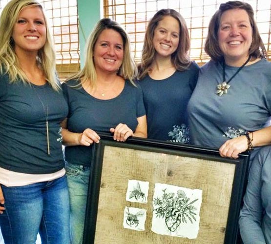
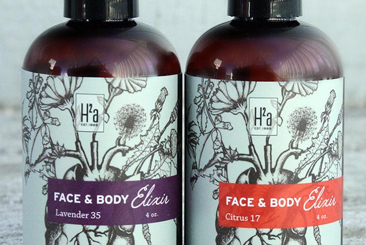
The central mark of the H2a visual identity is a custom illustration. They requested an illustration of a real heart exploding with herbal life, using an etched effect, that exudes all-natural wellness and love and could be used both with and without color, paired with the logo or standalone.


Packaging Design & Product Photography
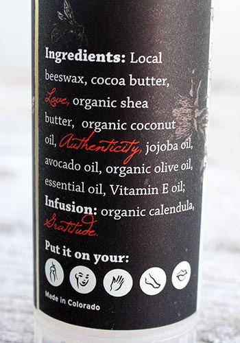
The illustration is intended to be used on all packaging in all forms: dark, light and full color. I also created custom icons, to be used after each instance of “put it on your…” in the product instructions, to make it fast and easy to discern what each product is for.


